6 min read
The Report I Never Submitted
I didn't submit.
Not "I entered and lost". Not "I ran out of time". I built a good chunk of it, looked at it, decided it wasn't good enough to be seen, and let the deadline walk straight past me.
That's the post. The rest is detail.
The Power BI Dataviz World Champs
It's back, running through Barcelona this year. Round 1 opened in June, open to anyone. One .pbix file, five pages maximum, and a scoring rubric that tells you upfront exactly what the judges care about.
Forty points, split evenly four ways:
- Insightfulness
- Visual effectiveness
- Creativity and innovation
- Accessibility
Accessibility is a full quarter of the score. Not a checkbox you tick on the way out the door. A quarter. Alt text, contrast, reading order, never leaning on colour alone to carry meaning. It's the quarter that gets left until last, and it's worth exactly as much as your cleverest insight.
Full details: Power BI Dataviz World Champs Barcelona, Round 1
Round 1 was football
Which, for me, was a gift.
Diehard Liverpool fan. And a considerably more diehard Football Manager player, going back to when it was still called Championship Manager. (My friend Charles Sexton has more hours logged than I do, and I've made my peace with that. Charles, we are overdue an online save. Sports Interactive, if you're reading this, I'm available.)
The dataset was PitchSide Pro, a fictional global e-commerce retailer selling kits, boots, national team gear and the sort of fan collectibles that ruin a household budget. Five years of it. 133,000 sales lines, 30,000 customers, eight regions, two channels.
The brief:
What is driving changes in revenue performance over time, and where should the business focus next to sustain growth?
Written for an executive leadership team. Five pages. Every pixel earning its place.
What I found
Revenue grew 43% across the five years. Good news, on the face of it.
Sessions grew 38%.
And the conversion rate sat at roughly 3.23%. Every single year. It never moved.
So the growth was traffic-led. They bought more visitors. They never got any better at converting the visitors they already had. Five years of expansion and the funnel never once tightened.
Then the channel split.
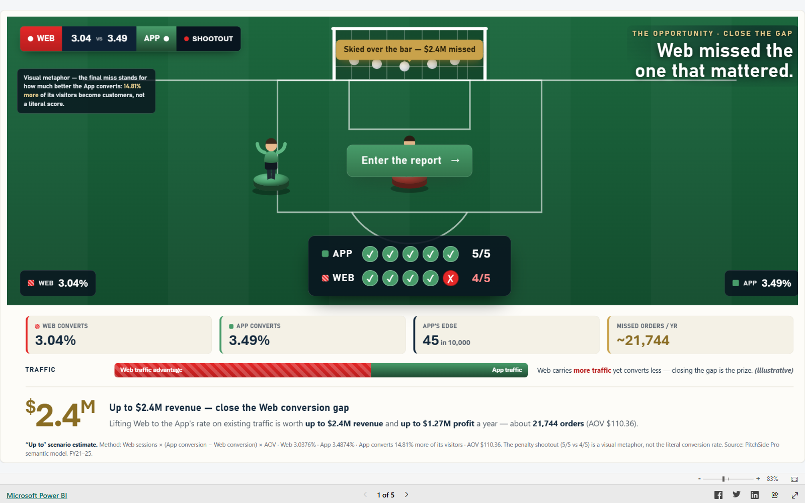
The mobile app converts at 3.49%. The web converts at 3.04%.
Less than half a percentage point between them. Small enough that nobody would notice it in a monthly pack. And the web is the channel carrying the bigger share of the traffic.
On the traffic they already pay for, closing that gap is worth up to $2.4M in revenue. Around $1.27M of that drops through as profit.
No new customers, no new markets, no extra ad spend. The same visitors, with the web ones finishing what they came to do at the rate the app's visitors already manage.
That was my thesis. It still is. Five years of growth, and nobody once looked at the difference between two numbers that were nearly the same.
The idea I was proudest of
A landing page where the first thing you see isn't a chart.
Two players. A penalty shootout. One takes the app's penalties, one takes the web's.
The app steps up five times and scores five times.
The web scores four, walks up for the fifth, and skies it over the bar.
Game over. That miss is $2.4M.
The entire thesis, delivered before a single visual has loaded, to an executive who has already decided how much attention you get.
I built that page. It's the first thing you'll see below, and it's the part of this I'd defend in a room full of judges.
Then I stopped
I planned all five pages. Wrote the narrative through them. Built the semantic model, the measures, the theme, a proper design system with one warm green accent doing all the signalling. Finished the cover. Finished the page behind it.
And then I started looking at it instead of working on it.
Judging it. Scrutinising it. Turning it over. More than 170 entries, all published in the open, all judged where everyone can see. I read that number and something in me quietly closed the laptop.
Three pages from the end. I'd done the hard part and stopped on the easy ones.
I have a perfect-or-nothing streak. It plagued me when I was younger, and it still turns up wearing a different coat. I'm better at spotting it than I used to be. I'm not free of it.
The deadline passed while I was deciding whether the green was the right green.
So here it is
Unfinished. Unpolished. Exactly where my head got to before it stopped.
Click it. Cross-filter it. Poke the years and watch the conversion line refuse to move.
Then keep clicking, because the wheels come off.
The Season has a giant floating $11M sitting in a lake of empty cream. Form Guide has a visual with no data in it at all, a blank white box politely labelled Year. The Open Goal sets my three recommendations in grey on cream, which is a contrast failure, on the final page of a competition where accessibility is worth a quarter of the marks.
I wrote that paragraph about accessibility earlier in this post with a completely straight face.
The conversion story in there is real, though. That part I stand behind.
Round 2 is LEGO
Brick by Brick, running on Rebrickable's public LEGO database. It closes on 19 July, and it adds a fifth judging criterion: storytelling and communication.
And I love LEGO a great deal more than I love football.
The rules say Round 2 is independent of Round 1. You can enter it having skipped the first one entirely. I read that line more times than I'd like to admit.
Mine's built. It's getting submitted. Finished, half-finished, or held together with hope.
Because an unfinished report scores nothing. And a report you never send scores exactly the same.